TAROT & COACHING BRANDING & WEB DESIGN
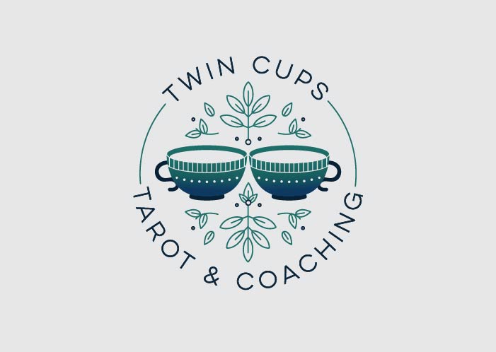
Skylar’s coaching style is all about reformatting thought process for the macro level. The symbolism in her new logo and brand name, Twin Cups, is meant to represent the one-on-one coaching style as well as a nod towards the Rider Waite Tarot deck Two of Cups. Partnership, unified love, and mutually beneficial relationships. The foliage is reminiscent of Eucalyptus, which grows naturally in her home town. Growth from sprouts and different levels of life paths are shown by the sizing of the leaves. The jewel tone color palette is near and dear to Skylar’s own style and expansive space.
After creating Twin Cups Tarot & Coaching’s new logo, Skylar reached out about a website! We used our new Taurus template as our foundation and customized it to exactly her brand.
